Information Design,
Data Visualization & Visual Storytelling
Hi, I’m Lucy, and I design visual systems, reports, presentations, and information-driven experiences that help organizations communicate complex ideas with clarity and purpose.
Throughout my career, I have worked with government institutions and global digital companies, translating technical information, performance metrics, and strategic insights into accessible and engaging visual narratives.
10+ years of experience helping transform complexity into understanding.
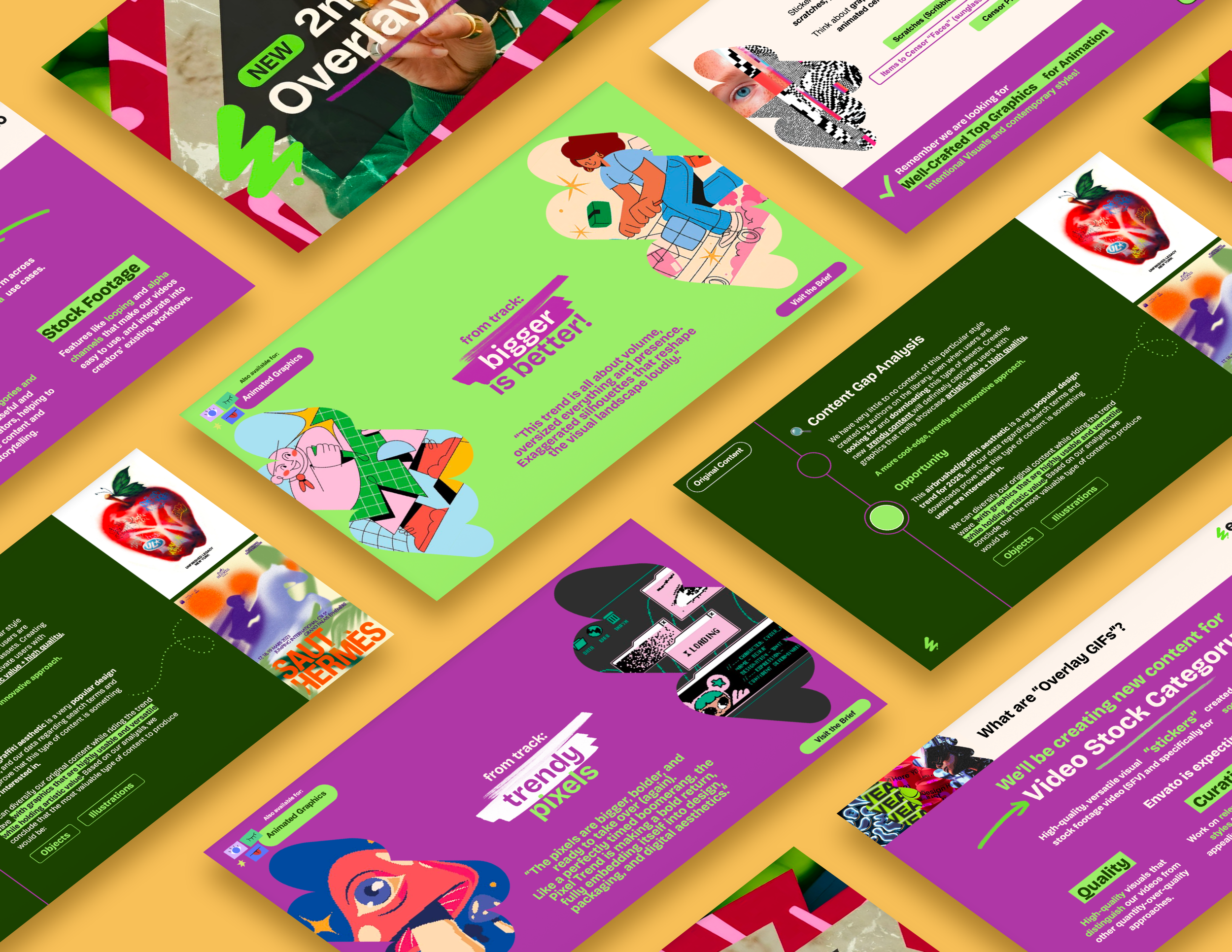
This is a selection of projects focused on information design,
guidelines-driven communication, and data visualization.
Information Design
*
Information Design *
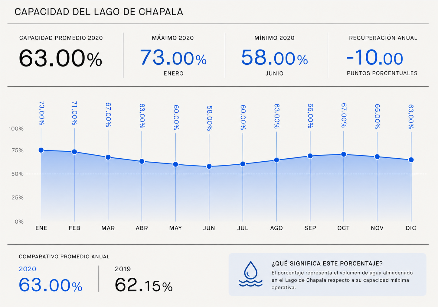
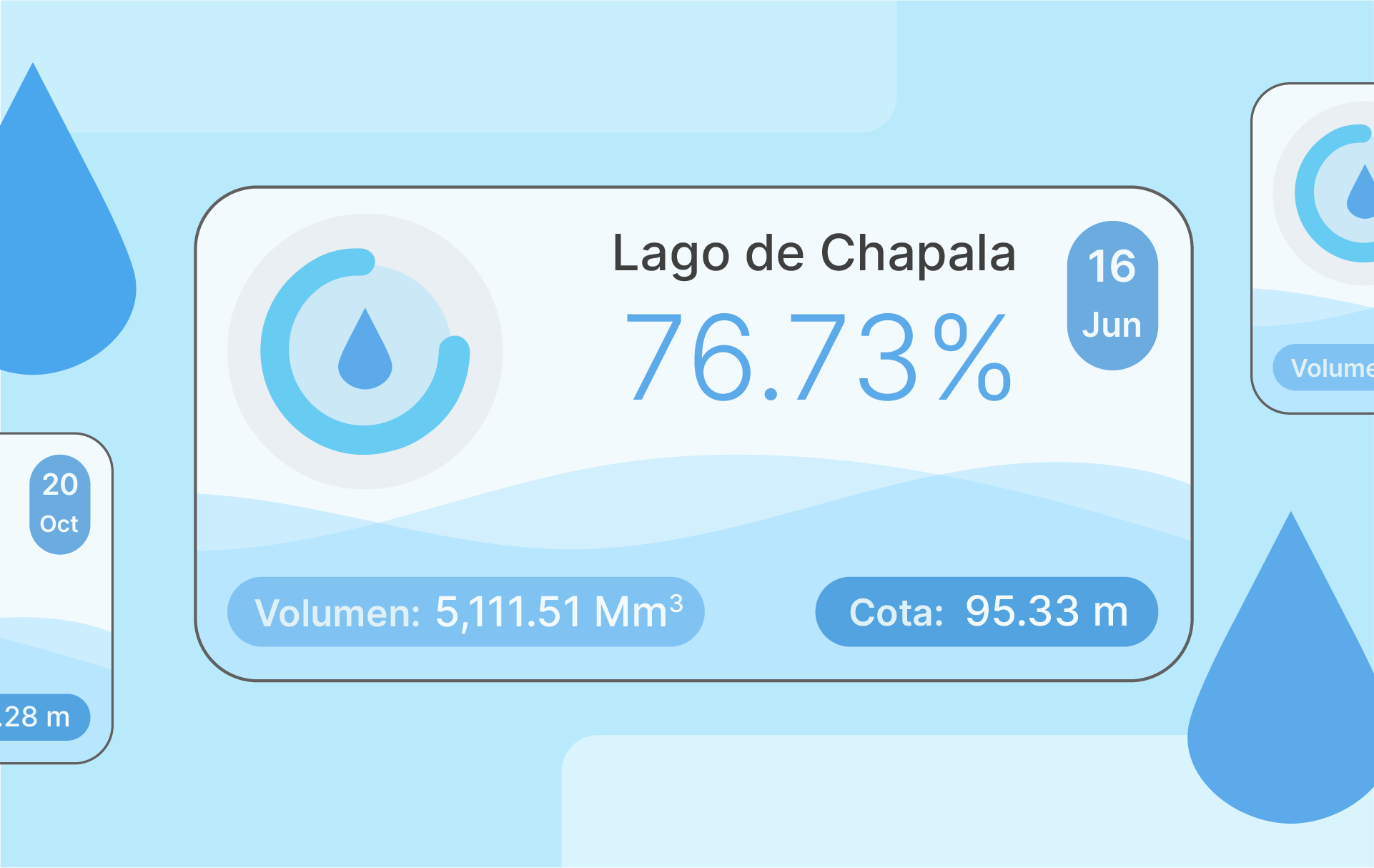
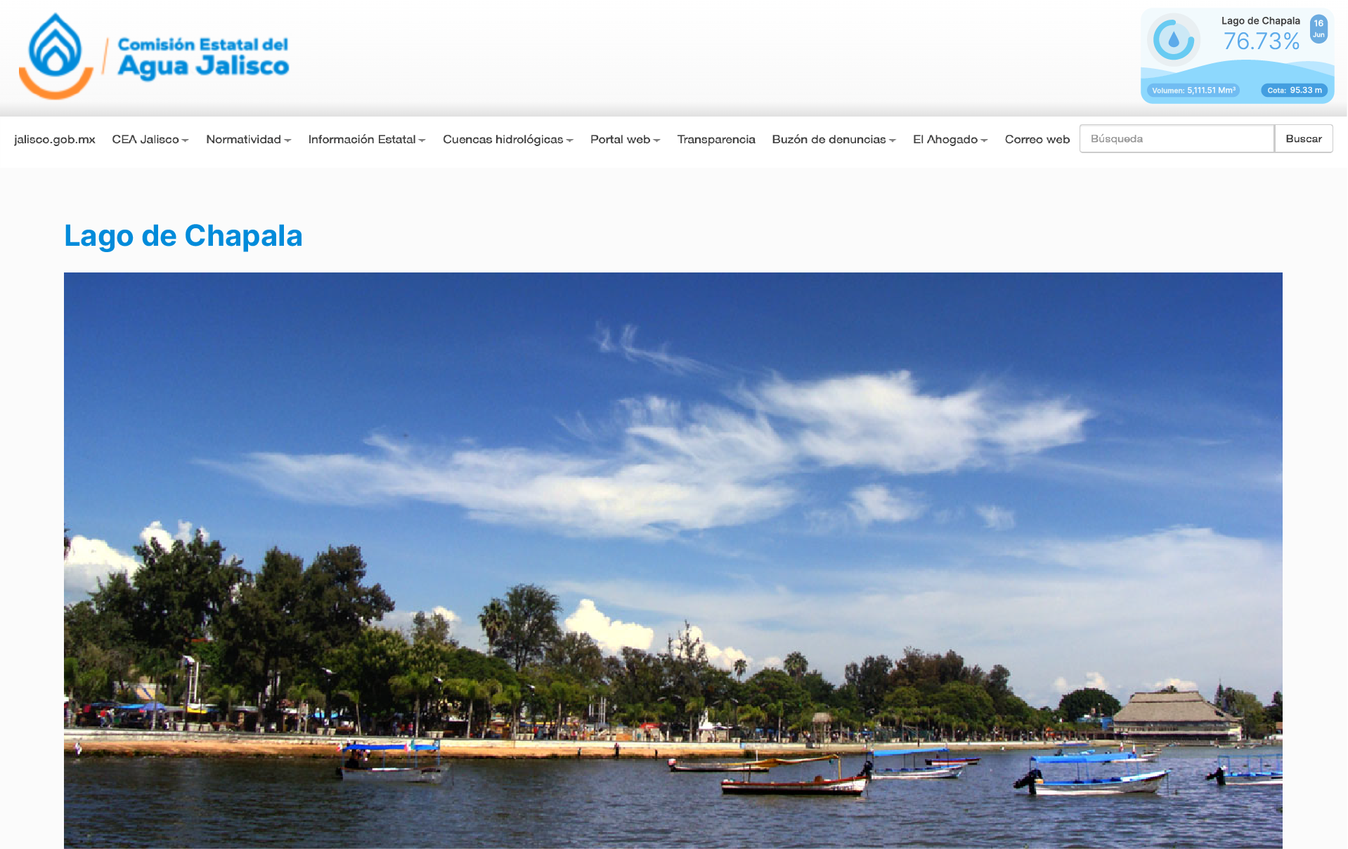
Chapala Lake Water Level Indicator
Government Information Design /
Comisión Estatal del Agua de Jalisco
Overview
This project was developed as a daily communication tool to provide accurate and accessible information about the lake's status. The system visualized key metrics such as water level, storage volume, and capacity percentage in a standardized format designed for public communication and media use.
Challenge
Journalists and institutions frequently requested updated information regarding the lake's water levels. Communicating this data consistently required a visual format that was easy to understand while maintaining accuracy and reliability.
My Role
As Head of Design & Image, I was responsible for designing the visual communication system and developing a format that transformed technical hydrological data into a clear, accessible daily report.
NOTE: Some visuals have been recreated for portfolio purposes based on real projects and responsibilities. Sensitive or confidential information has been replaced with representative data.
Outcome
The system streamlined access to critical information, improved consistency in public communication, and facilitated the dissemination of accurate data to media outlets.
Solution
A standardized visual reporting system was created to present daily measurements, key indicators, and historical context through a concise, visually engaging format.
Visual Storytelling
*
Visual Storytelling *
NOTE: Some visuals have been recreated for portfolio purposes based on real projects and responsibilities. Sensitive or confidential information has been replaced with representative data.
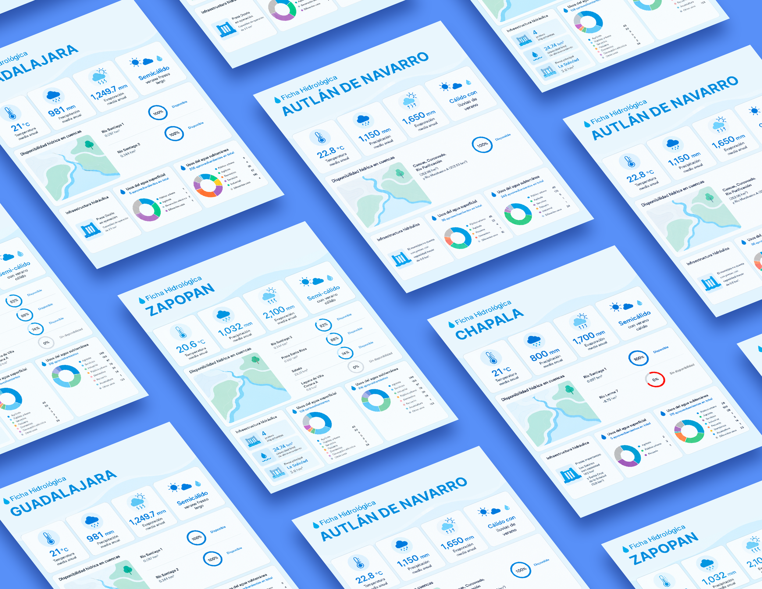
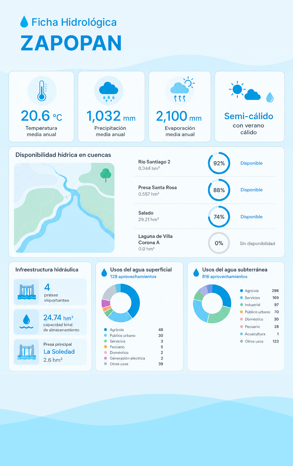
Hydrological Profiles of Jalisco Municipalities
Government Information Design / Comisión Estatal del Agua de Jalisco
Overview
A series of visual information sheets designed to communicate hydrological and water infrastructure data for municipalities across the state of Jalisco.
Challenge
Municipal water information often appears in technical reports that are difficult for non-specialized audiences to interpret. The challenge was to consolidate multiple data sources into a standardized and visually accessible format.
My Role
I led the visual design and information architecture of the municipal profiles, ensuring consistency across all materials while making complex technical information easier to understand.
Outcome
The resulting profiles improved accessibility to municipal water information and provided a consistent communication tool for institutions and the general public.
Solution
Using principles of information design, visual hierarchy, iconography, mapping, and data visualization, each profile was transformed into a concise and user-friendly reference document.
Business Performance Reporting & Executive Presentations
Envato / Freelance Work


Overview
A collection of presentation materials developed to communicate business performance, trends, and strategic insights through clear and engaging visual storytelling.
Challenge
Business and performance data can be difficult to communicate effectively when presented as raw numbers. The objective was to transform complex information into presentations that supported understanding and decision-making.
My Role
I designed presentation materials that combined visual hierarchy, storytelling principles, and data visualization techniques to communicate key findings and recommendations.
Outcome
The presentations enabled the quick identification of trends, a better understanding of performance metrics, and more informed decision-making.
NOTE: Some visuals have been recreated for portfolio purposes based on real projects and responsibilities. Sensitive or confidential information has been replaced with representative data.
Solution
Charts, dashboards, visual frameworks, and narrative structures were used to highlight relevant insights while maintaining clarity and consistency across presentations.


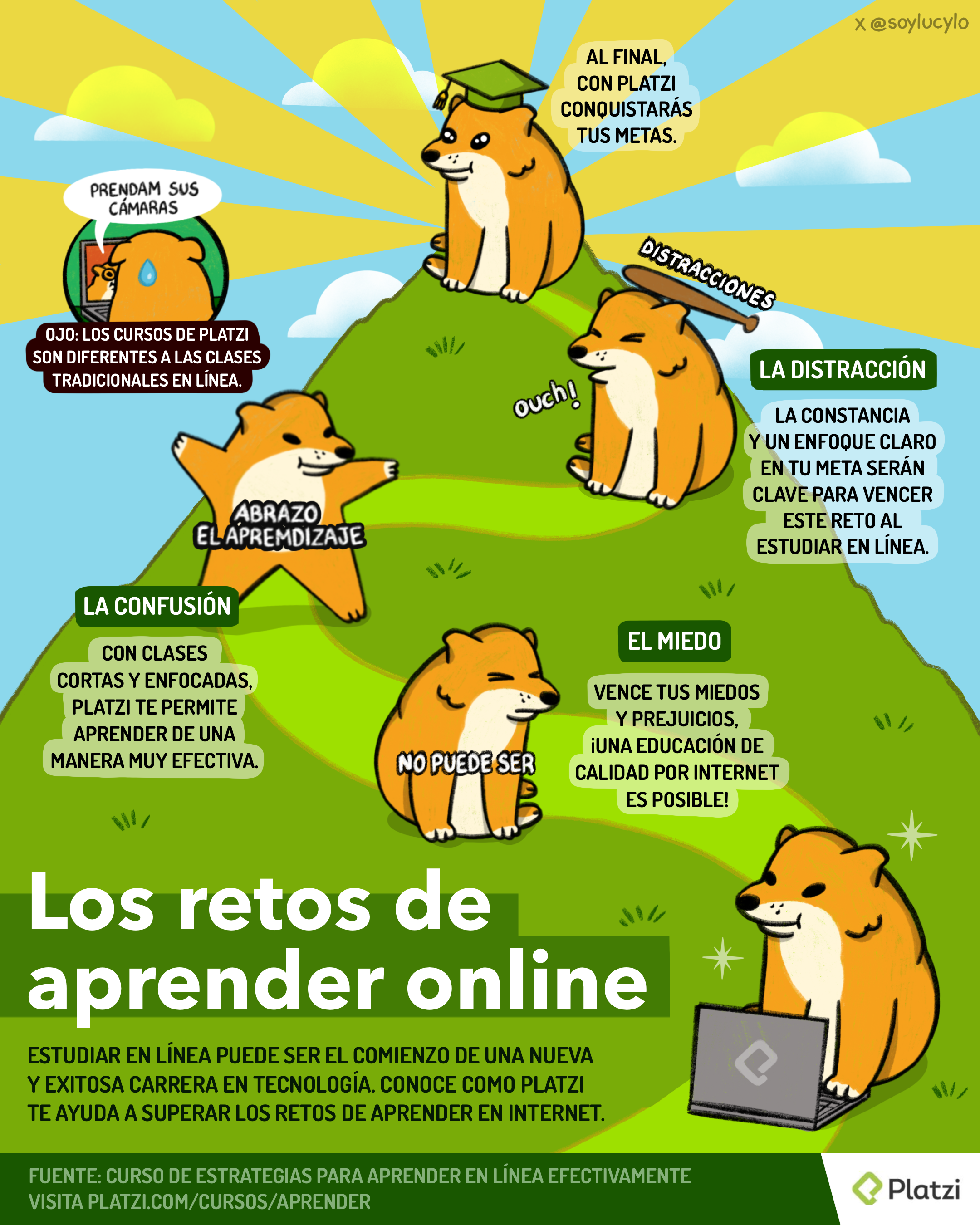
Visual Storytelling Through Information Design
Platzi / GymFographic Contest
Overview
This infographic was created for Gymfographics, an information design competition organized as part of Las Platzi Olimpiadas. The challenge was to communicate a complex topic through visual storytelling while maintaining clarity, engagement, and educational value.
The project was awarded 3rd Place among participants from the Platzi community.
Challenge
Online learning often presents emotional and motivational barriers that are not immediately visible, including confusion, distractions, fear of failure, and maintaining consistency over time. The challenge was to communicate these obstacles in a relatable and engaging way while encouraging learners to continue pursuing their educational goals.
Outcome
The project received 3rd Place in the competition and demonstrated the ability of information design to transform educational concepts into memorable visual narratives that are both informative and accessible.
Solution
Using a narrative journey format, the infographic visualizes the learning process as a climb toward a goal. Each stage represents a common challenge faced by online students, supported by concise educational messaging and character-driven storytelling to improve engagement and comprehension.
I transform complex information into clear visual narratives that help people understand, decide, and act.